Imagine you’re using a lot of OpenTelemetry and Prometheus metrics on a crucial platform. You’re gathering a lot of data, but you can’t make sense of it. You need to visualize the distribution of your measurements to identify patterns, outliers, and trends. But there’s a problem: Your current tools don’t support histograms.
Incorporating histograms is not just a technical upgrade—it’s a necessity for any observability professional. By starting with histograms, you can unlock deeper insights and drive more informed decisions in your projects.
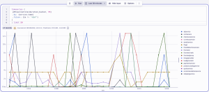
We’re excited to announce that Dynatrace has introduced support for OpenTelemetry histograms in connection with the new visualization options in Dashboards and Notebooks. The histograms are supported starting from Dynatrace version 1.301. OpenTelemetry histograms complement the Distributed Tracing app, which uses histograms as the default visualization tool for response times.
In this blog, we will focus on histograms and why to use them. We will cover their main value and possibilities in OpenTelemetry.
What are histograms, and why use them?
A histogram is a specific type of metric that allows users to understand the distribution of data points over a period of time. This is particularly useful for metrics such as response times or payload sizes, where understanding variability and outliers is important. By analyzing how data points are spread out, teams can detect patterns or trends that might not be visible through simple averages or totals.

Histograms are commonly used to define and monitor service-level objectives (SLOs). They can help determine the percentage of requests that meet a specific response-time threshold, which is essential for maintaining service quality.
In practice, histograms are useful when the measurement distribution is relevant and the data sets are large. Teams can also change queries to get answers on already-collected data without needing to redefine metrics or wait for new data to accumulate.

Breaking down the benefits of OpenTelemetry histograms
OpenTelemetry instrumentation automatically generates histograms for HTTP client and server request durations. This feature, available by default for OTel-instrumented services, gives users a standard way to consistently measure and compare response times across different services.
Moreover, the OpenTelemetry Collector can measure service span durations, categorized by span names, span kinds, and status codes. The span metrics connector creates these measurements and presents them as histograms, which you can analyze in Dynatrace for deeper insights.
Histograms also enhance the self-monitoring capabilities of the Collector. It reports batch sizes and HTTP/RPC measurements of its own pipelines as histograms, providing valuable metrics for performance monitoring. This self-monitoring aspect is crucial for maintaining the health and efficiency of the Collector itself, ensuring that it can handle the demands of large-scale data collection and processing without degradation.
Additionally, the Collector supports converting Prometheus and StatsD histograms into the OpenTelemetry protocol (OTLP), making them compatible with Dynatrace. By exporting metrics from different sources into a single platform, teams can achieve a holistic view of their system’s performance, facilitating proactive issue resolution and faster decision-making.
Percentiles to simplify analysis
Percentiles are statistical measures that divide a data set into 100 equal parts, providing a way to interpret specific points within your histograms. For instance, the 90th percentile (p90) is the value below which 90% of the data falls.
In practical applications, percentiles are particularly useful for web performance analysis. By examining the p90, you can identify the maximum response time experienced by 90% of users. This insight is crucial for optimizing performance for the majority of users. However, it also highlights that the remaining 10% of users experience longer wait times, which could lead to dissatisfaction.
With the Dynatrace Grail data lakehouse, extracting percentiles from histograms is straightforward, especially when using Notebooks. You can seamlessly integrate percentile graphs into dashboards, providing clear and actionable insights.

What about managed Dynatrace?
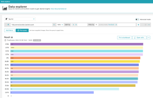
All managed Dynatrace customers who don’t have Grail can still access histogram summaries (min|max|sum|count) and buckets, and they can use Data Explorer for histogram visualization. It’s important to note, however, that the percentile calculation requires Grail (Dynatrace SaaS).

Support for explicit and exponential histograms
The first metrics API/SDK release in the OpenTelemetry project introduced histograms with explicit bucket boundaries. These histograms are very popular and are also widely used by Prometheus. Dynatrace now fully supports them.
Later, OpenTelemetry introduced exponential histograms, with each consecutive bucket exponentially larger than the previous one. These histograms are more efficient in carrying a high dynamic range of different values and ensure that the relative error for every bucket remains stable. Dynatrace now supports exponential histograms by calculating histogram summaries (min, max, sum, count). But for now, percentile calculation and buckets are available only for explicit bucket histograms.
Try OpenTelemetry histograms
To experiment with OpenTelemetry histograms, you can deploy the OpenTelemetry Demo Application (Astronomy shop) with the span metrics connector. See this blog about exporting the data from the demo app to Dynatrace.
To learn more about the histograms in Dynatrace, see Histogram Visualization in Dynatrace docs.
For easy analysis of trace data with histograms, check out the new Distributed Tracing app. You can also check out this demo: Transform OpenTelemetry data into actionable insights.
As a leading contributor to the OpenTelemetry project, Dynatrace is committed to advancing its features and maximizing its value. By collaborating with the community and other vendors, Dynatrace ensures that OpenTelemetry remains cutting-edge, accessible, and user-friendly for everyone.
The post OpenTelemetry histograms reveal patterns, outliers, and trends appeared first on Dynatrace news.